Colour Fundamentals: Mixing, Harmony, and Practical Tests
Colour Fundamentals: Mixing, Harmony, and Practical Tests
Colour work is both sensory and analytical. Learning to mix and judge colour reliably requires a combination of practical tests, limited experiments, and a few organizing principles. The suggestions below favor direct practice and repeatable checks rather than abstract rules alone.
Start with a reduced palette
Limiting your palette simplifies decisions and teaches relationships. A common approach is to use one warm and one cool primary from each hue family: a warm red and a cool red, a warm yellow and a cool yellow, and similarly for blues. With fewer pigments you learn how mixes behave and which pigments dominate or dull others.
Make a mixing chart
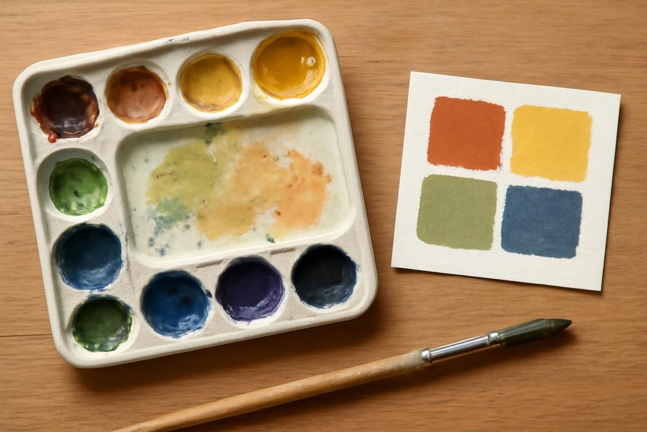
Create a simple chart that shows mixes between your chosen pigments. Paint a small square for each pure pigment and intermediate mixes. Include a neutral row by mixing complementary colours. A chart becomes a reference that reveals predictable shifts in hue, chroma, and value.
Value-first thinking
Perceived colour is heavily influenced by value. Before worrying about hue, check whether two areas are similar or different in value. If values match, then hue decisions become clearer. Use quick grayscale studies or squinting to judge relative value before adjusting colour mixes.
Check colour temperature and local colour
Local colour is the inherent colour of an object, but appearance changes with light and context. Test how a local colour looks under warm and cool light, and how it shifts beside different neighbours. Small painted tests that place a colour beside several background tones will show how context alters perception.
Desaturate to test relationships
Desaturation is useful for checking colour harmony. Mix a colour with a little of its complement or add a neutral grey to see how it behaves when dulled. Many successful palettes include tempered colours rather than fully saturated primaries. Learning to control chroma expands your expressive range.
Use small, focused exercises
Practical tests can be short and clear. Pick a single colour challenge and spend a session on it. Examples:
- Match the mid-tone of a photographed fruit using only three paints.
- Create a harmonious three-colour palette and paint a small still life with it.
- Paint the same scene at three times of day to observe temperature shifts.
Observe pigments over time
Some pigments shift as they dry, while others remain stable. Keep notes on how your chosen materials behave and test new pigments in small studies before incorporating them into larger works. Familiarity with materials reduces surprises and increases control.
Practice selective restraint
Colour impact often depends on contrast and restraint. A single bright colour can gain power when surrounded by muted tones. Learning when to limit chroma is as important as learning how to mix a vivid hue.
Over time, mixing confidence grows through repeated, intentional experiments. Keep a reference book, note effective mixes, and return to basic tests periodically. Colour fluency is a practical skill built by observation, testing, and subtle adjustments rather than only conceptual study.